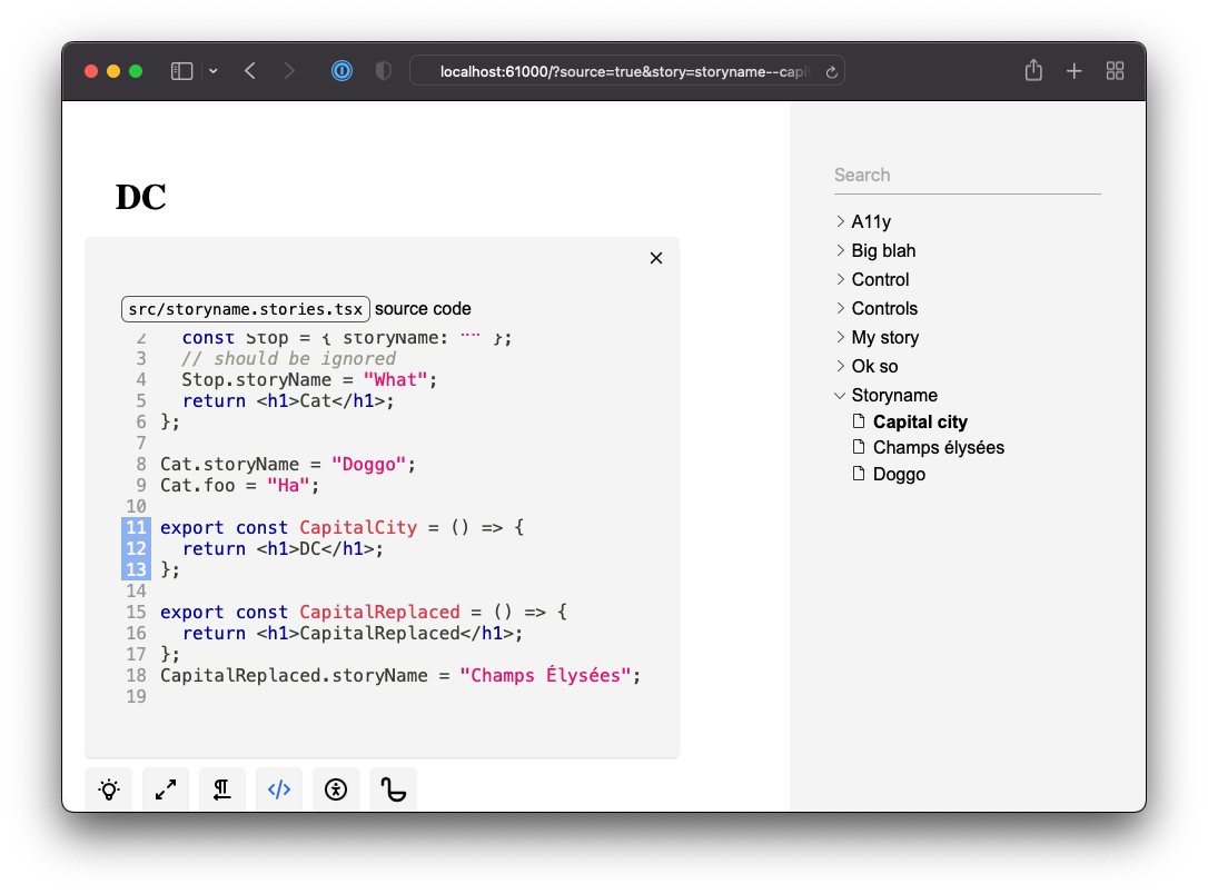
Story Source
You can preview the source code of the active story and its origin.
Hyperlink
You can customize the header of the source addon through .ladle/components.tsx:
.ladle/components.tsx
import type { SourceHeader } from "@ladle/react";
export const StorySourceHeader: SourceHeader = ({ path }) => {
  return (
    <b>
      Github link? <code className="ladle-code">{path}</code>
    </b>
  );
};
This might be useful if you want provide a hyperlink.
Source Theme
You can customize the theme of the source code highlight through .ladle/config.mjs:
.ladle/config.mjs
import { themes } from "prism-react-renderer";

const customDarkTheme = {
  plain: {
    color: "salmon",
    backgroundColor: "#1E1E1E",
  },
};

/** @type {import('@ladle/react').UserConfig} */
export default {
  addons: {
    source: {
      themeLight: themes.github,
      themeDark: customDarkTheme,
    },
  },
};
Each theme object must be a PrismTheme type.